Therapeutic Color Zoning: The New Way to Design Home Wellness
In today's fast-paced world, our homes are becoming more than just living spaces—they're transforming into personal wellness sanctuaries. Color zoning, a sophisticated interior design approach that divides spaces through intentional color use, has evolved beyond mere aesthetics into a therapeutic practice. This strategic color placement throughout your home isn't just visually appealing; it's being embraced for its profound psychological and physiological benefits. As boundaries between work and personal life continue to blur, homeowners are increasingly turning to this method to create distinct functional zones that support mental wellbeing, productivity, and relaxation—all without changing their floor plans.

The Science Behind Color Psychology in Home Environments
Color psychology isn’t new—ancient civilizations from Egypt to China incorporated specific hues in their dwellings based on their observed effects on mood and energy. What’s revolutionizing modern interior design is our deepened scientific understanding of how color affects brain function and physiological responses. Research from the Journal of Environmental Psychology shows that specific color wavelengths trigger distinct neurological reactions—blues and greens activate parasympathetic nervous system responses that lower blood pressure and heart rate, while reds and oranges stimulate cognitive function and energy.
Neuropsychologists have documented that color perception happens not just through our eyes but affects our entire biological system. When we enter a blue room, for instance, studies show measurable decreases in stress hormones like cortisol. Meanwhile, yellow environments have demonstrated increased production of serotonin, the happiness hormone. This scientific foundation has transformed color zoning from decorative technique to evidence-based wellness strategy, with designers now collaborating with health professionals to create spaces that actively contribute to occupants’ mental health.
Mapping Your Home’s Emotional Landscape
Implementing therapeutic color zoning begins with a comprehensive emotional mapping of your living space. This process involves identifying the primary activities and desired emotional states for each area of your home. Working zones may require colors that enhance focus and cognitive function, while relaxation areas benefit from hues that lower stress responses and promote rest. This isn’t about following trends but creating a personalized color prescription based on your specific needs and responses.
Start by keeping a mood diary for different spaces in your home, noting how you feel in each area and what activities you typically perform there. Notice where you experience stress, fatigue, or energy slumps throughout the day. This personalized data becomes invaluable when designing your color zones. Remember that individual reactions to color can vary based on cultural background, personal associations, and even genetic factors—what energizes one person might overwhelm another. Professional color consultants now use specialized tools to measure individual physiological responses to different hues, allowing for truly customized color prescriptions that go beyond generic color recommendations.
Creating Transition Zones Between Color Areas
One of the most sophisticated aspects of therapeutic color zoning is managing transitions between differently colored areas. Abrupt color changes can create visual and psychological jarring that undermines the therapeutic benefits. Design professionals are developing nuanced techniques to create gradient transitions that help the brain adjust between different emotional and functional states within the home.
Transition zones can utilize gradient walls where one color slowly blends into another, or incorporate neural palette cleansers—neutral spaces that serve as visual buffers between intensely colored areas. Hallways offer perfect opportunities for these transitions, functioning as decompression corridors that prepare occupants for the next emotional experience. Some designers utilize sensory integration techniques, pairing transitional colors with subtle texture changes or lighting adjustments to enhance the psychological shift between spaces. This graduated approach helps household members unconsciously adjust their mental state when moving between a stimulating home office and a calming bedroom, for example.
The Emerging Field of Chronobiological Color Design
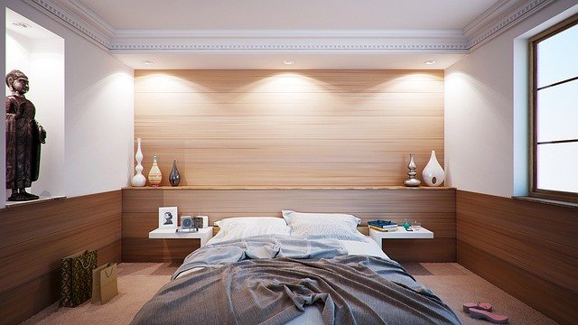
Perhaps the most cutting-edge development in therapeutic color zoning is chronobiological color design—the practice of adapting home colors to support natural circadian rhythms. This approach recognizes that our color needs change throughout the day in accordance with our biological clocks. Morning spaces benefit from energizing hues that mimic sunrise tones, while evening areas should transition to deeper, warmer colors that signal the brain to begin producing melatonin for sleep.
Smart home technology is rapidly integrating with this practice through programmable lighting systems that automatically adjust color temperature throughout the day. Some sophisticated systems can now sync with wearable devices that monitor individual biorhythms, adjusting room colors based on detected stress levels or energy needs. Designers are even creating seasonally adaptive color schemes that compensate for reduced natural light exposure during winter months to combat seasonal affective disorder. This dynamic approach to color zoning represents a significant evolution beyond static color choices, treating the home as a responsive environment that actively supports biological wellbeing throughout the day.
Combining Color Zoning With Multisensory Design Elements
Therapeutic color zoning reaches its full potential when integrated with other sensory design elements. The brain processes environmental information through multiple channels simultaneously, and forward-thinking designers are creating multisensory color zones that address sight, touch, smell, and sound. This holistic approach amplifies the psychological impact of color choices and creates more immersive functional spaces.
Texture plays a crucial role in this integration—rough textures can intensify the stimulating qualities of warm colors, while smooth surfaces can enhance the calming effects of cool tones. Similarly, scent diffusion systems are being incorporated to complement color psychology, with energizing citrus scents paired with productive yellow spaces and lavender notes enhancing relaxation in blue areas. Acoustic considerations further complete the sensory experience, with sound-absorbing materials used in relaxation zones while allowing for more acoustic reflection in creative spaces. This multisensory approach acknowledges that our experience of space involves far more than visual perception and represents the future direction of therapeutic interior design.
Measuring Success: Biometric Feedback in Color Design
How do we know if therapeutic color zoning is actually working? The latest approach involves quantifying results through biometric feedback. Homeowners and designers are increasingly using wearable technology to measure physiological responses to different color environments, collecting data on heart rate variability, skin conductance, and even brain wave patterns to fine-tune their color schemes for optimal wellbeing.
This evidence-based approach has transformed color selection from subjective preference to measurable health intervention. Some interior design firms now offer follow-up consultations that include biometric testing to validate the effectiveness of color choices and make scientific adjustments. This emerging field of quantifiable design outcomes represents a significant shift in how we evaluate interior design success—moving beyond aesthetics to measurable improvements in inhabitants’ mental and physical health. As this practice becomes more accessible, expect to see more homes designed not just to look good but to demonstrably improve quality of life through strategic color application.


